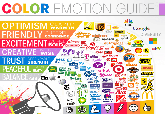
The term ‘logo’ derives from the Ancient Greek term ‘λόγος’, which can be interpreted as ‘word’, ‘speech’, and ‘reason’ among other of its many meanings. By creating your logo, you’re creating your own word – something to name you and identify you.
This is why logo is the most important part of any visual identity. It is a symbol that represents both you and your business, and therefore it should be carefully designed. This article will give you an insight in how colours can affect the meaning of your logo, and thus its design.
The Meaning behind the Colour
Before we start discussing how different colours are perceived by people, it must be said that these meanings should not be taken as universal and definite. Although colour psychology has derived certain general rules, it is a fact that different cultures perceive colours and symbolism behind them differently. For example, white is generally regarded as symbol of purity in western cultures, but in India it symbolises death. Therefore, be careful when choosing a colour for your logo, but take the following meanings with a grain of salt.
Meaning of white: As it was already mentioned, white is mostly associated with purity, simplicity, hope, cleanliness, goodness, and even with naiveté. From the practical standpoint, white logo can never stand on its own, it needs to be accompanied by another colour as a background. It’s a good idea to have a white version of your logo in any case, for situations where you have dark backgrounds on which coloured logos can’t stand out.
Meaning of black: This colour has very ambivalent meanings. On one hand it related to death, evil and darkness, but is also a symbol of power, sophistication and mystery. As it is the case with white logo, most graphic designers from Sydney agree you should make a black version of your logo, regardless of the colour you decide. Just as the white logo pops up on dark backgrounds, black logo is the best on white ones. Moreover, you may need to use your logo in monochrome, and you want to make sure it looks good in black version.
Meaning of red: Red generally implies energy, dynamism, energy, love, and passion on one hand, and danger and aggression on the other. Many food businesses choose this colour for their logos, because it is said to stimulate appetite.
Meaning of yellow: This colour is also abundant with almost contrasting meanings. It represents friendliness, warmth and intellect, but it is also associated with warnings, caution and cowardice. Therefore, you should be careful if you want to use yellow. Similarly to the colour red, it is believed that it affects appetite.
Meaning of blue: It represents sincerity, professionalism, integrity, calmness, confidence, and integrity. Because of these features, it is the most common colour used for corporate visual identity. It is also often used for logos of government institutions because it is linked with success and authority.
Meaning of orange: It stands for ideas, thinking, innovation, and creativity. You should also consider this colour if you want to express approachability, fun, and youthfulness.
Meaning of green: Green is related to nature, life, growth, freshness, as well as money. It is often used for companies that are connected with nature and food growth, especially vegetarian and organic food. It is also used in finance, because of its association with money.
Meaning of purple: It is the colour of dignity, luxury, royalty, and wisdom. Historically, it has been associated with royal houses and church.
Meaning of grey: Although it may seem dull and uninteresting, grey is actually associated with positive characteristics such as authority, maturity, security, and stability.

One Colour or Combination of More?
Now that you have the gist of the intricate pattern of colour meaning, you may wonder if only one colour is enough for you. General consensus is that you should stick to one colour. Although there are many successful examples of multi-coloured logos, such as Google, Microsoft, and eBay, it is always better to stick to the rule ‘simple is better’. If you decide to experiment with more colours, make sure you study colour combinations carefully.
Brighter or Darker Shades?
There is no definite answer to this question. The brighter shades can be seen as powerful and energetic, and they are also eye-catching. However, to some people they may seem too bold, rude and even be overwhelming.
Darker and more muted shades are generally linked with sophistication and class, but are also less attention-grabbing and can be ignored and less memorable. Ultimately, the choice is on you, and the meaning you choose to attribute to them.
Conclusion
As the most important element of your identity, your logo should be meticulously designed. This, of course, includes picking the right colour. Although you should be careful when choosing your signature colour, it doesn’t mean you should rely solely on the meanings attributed to certain colours or shades. Take the meanings into account, but ultimately choose a colour you feel is the right one, and try to limit yourself to one.


