
When it comes to the app development, the Picasso’s quote comes to mind: “Good artists copy; great artists steal”. Actually, it’s quite a rare case when a good idea comes from nothing and there’s nothing bad in using the experience (no matter good or bad) of your competitors to succeed.
If you are planning to create a fitness app, you definitely should have some USP as well as ensure that your application is based on familiar behavioral patterns and has a nice design.
What are they for mobile fitness industry? Let’s check the 10 most amazing App UI Designs to find out!
# 1: Fitbit
Fitbit is one of the most popular health applications in the world with over 10,000,000 downloads only on Android. So not a surprise that it’s also one of the fitness app design trendsetters.
If you take a look at the app’s UI, you’ll notice all the traditional features of the minimalistic design:
- Intuitive navigation that dramatically cuts the number of buttons.
- Plain interface which doesn’t include any excessive elements and is aimed only at providing the most useful info.
- The text is replaced with icons and images where it’s possible.
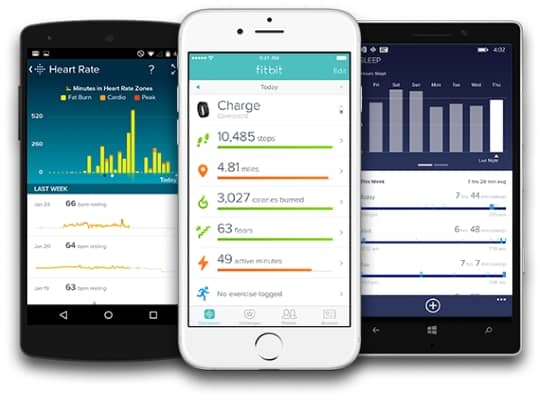 Moreover, despite the app consists of a few different blocks (e.g. activity & workouts, weight & nutrition), the fitness app design is consistent: all screens use the single color scheme (with slight adjustments) and navigation patterns.
# 2: Nike+ Training Club
It was just a matter of time when such a huge sportswear corporation would develop a fitness app of its own. Today the application is widely used by sports professionals and amateurs all over the world.
Nike+ Training Club’s design is completely different from Fitbit’s one on the one hand (if you compare only the visual side) but quite similar on the other hand.
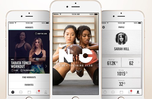 The key similarity is the minimalistic approach that leaves only the essential data and navigation elements on the screen.
However, to make the application more aesthetically appealing, developers filled it with bright HD photos, what is quite different from what we’ve seen in the Fitbit app, isn’t it? You may reuse the idea when you design a fitness app for your business or startup.
# 3: Google Fit
Google Fit is rather a health-tracking application than a fitness app. It helps users to stay informed about their day-to-day activity that may include strolling, cycling, swimming etc.
Since the app doesn’t include many features and has no need in a sophisticated interface; the Google Fit’s design is quite plain.
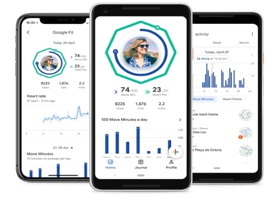 Three main screens — Home, Journal and Profile — all have a white background with a lot of free space to draw users’ attention to the content itself.
Also, you can easily notice that developers reused the same visual elements to develop a fitness app for wearable devices. This let us make the following conclusion: if you want to design a fitness app for both smartphones and wearable devices, ensure the consistent UI between all the platforms.
# 4: Freeletics
Freeletics is a workout application with over 900 sets adapted to the user’s schedule, goal and fitness level. Sounds similar to Nike+ Training Club, doesn’t it? So no wonder that this workout app design looks alike, too!
The app’s UI is another example of how you can use high-quality photos and videos in your mobile application.
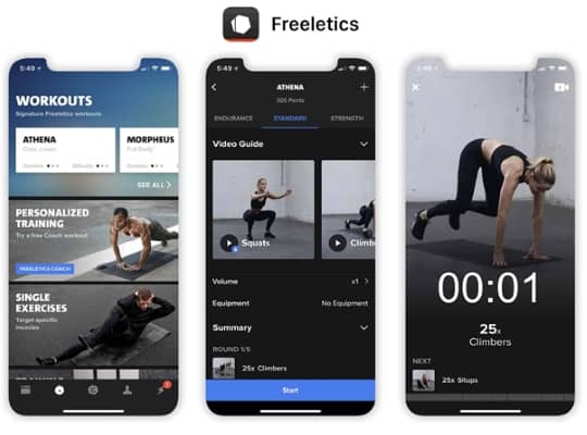 Also, pay attention to the typography. By using different fonts, colors, small and capital letters in the workout app design, developers are able to emphasize the most important information and build a user journey through the application.
# 5: Runkeeper
This is a typical tracking app that has no other features except for the ones you need for jogging or cycling: a map to recreate your route, time & distance trackers, fitness plans and goals, a weather screen.
Just like Fitbit, the app uses bright eye-catching colours (Medium Turquoise, to be more specific) to make users feel happy and full of energy.
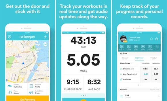 Traditionally, in this fitness app design, the amount of text is reduced to the minimum; icons are also widely used within the application.
# 6: Workout for Women
If you’re looking for the best fitness app design for your own health & fitness application, Workout for Women can provide you with a few good ideas, too!
Overall, the app’s UI looks pretty similar to what we’ve already reviewed: HD-photos that motivate you to work harder to get the body like the one you see right now and a consistent pink-violet colour scheme over all screens etc. So what idea can you reuse for your own application?
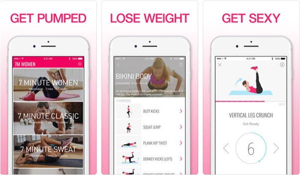 Animated guides to the exercises! It’s can either be:
- a unique UI element that will provide your application with a kind of “personality” (like the dog Taco in the Trello app);
- a good solution if don’t have a possibility to record video guides with real coaches.
Also, make sure that the animated hero matches you workout app design and looks harmonious within the application.
# 7: 30 Day Fitness Challenge — Workout at Home
If you think that the best fitness app design should always be fancy, this application proves the opposite.
It looks so simple and basic (in a good way) that you can easily confuse it with some other apps developed by Google itself. People trust Google and its services, so if mobile users see something similar, they are more likely to trust that product, too.
 So here are the specific features of this fitness app design:
- The app is using material design in its “classic” form, without any deep customization;
- Navigation elements also look quite standard.
- The typography is the same as in apps by Google.
- The color scheme consists of the white & green background with orange and blue buttons.
# 8: Studio Tone It Up: Workouts
Frankly speaking, this app isn’t very popular (over 10,000 downloads on Google Play Market) but it’s also an interesting case to consider as you’re trying to create the best fitness app design for your project.
 We’ve already stumbled upon workout videos in the Nike+ Training Club app. However, you may have noticed that these guides are located at the top of the page, taking less than half of the screen.
In the Studio Tone It Up app, users are offered the full-screen experience. Workout videos fill almost the whole screen, helping users to concentrate on the exercise and its technique. That’s a good example to follow as you develop a fitness app.
# 9: 7-Minute Workout for Kids
Another well-known fact is that your workout app design should meet the preferences and expectations of your audience. By the way, this rule is always followed by the Stormotion team. What am I talking about?
 Take a look at the 7-Minute Workout for Kids app and you’ll get it:
- White or one color background (which may be cool for adults but is too boring to kids) is replaced with a bright patterned image.
- Since kids don’t appreciate HD-photos or videos as much as their parents, workouts are performed by animated heroes who are more interesting to interact with.
- The fonts are also a bit more childish.
# 10: CARROT Fit
Finally, don’t be creative and fun! There are enough similar fitness applications so if you want to stand out, your app should have some uniqueness.
 CARROT Fit developers created a hilariously snarky fitness app with an out-of-the-common design. By using bright colors and funny animated heroes they’ve managed to attract public attention (the application was featured by a few major news agencies) and build a solid customer base.
Takeaways
These were top 10 best fitness app designs that may be a good source of inspiration for your own project. Let’s briefly remember our main conclusions:
- Minimalistic designs are quite popular nowadays.
- Bright colors can encourage users and fill them with energy.
- Use different typography to guide people through the application and manage their attention.
- Full-screen HD-photos and videos can greatly improve the UX. However, they can also be replaced with nice or funny animations.
- Last but not least! Imagine your typical users and try to guess what UI elements they expect to meet in your app.

